install.packages("pacman")SIS Visual Representation
Using Static, Interactive and Statistical (SIS) Graphs to reveal the demographics and relationships of a city.
Introduction
In this article, I will share how we can leverage on Static, Interactive and Statistical (SIS) graphs to conduct appropriate data visualisation and draw statistical conclusion from the data set. In this article, we will explore varios libraries such as parsetR, ggstatsplot and ggplot.
Libraries
Instead of using the base R function such as library() or install.packages(),we will use the p_load function from the pacman package that combine these functions together. Before using the package, you will need to install the package from CRAN.
For this analysis, we will use the following packages from CRAN.
parsetR - Visualize your data with interactive d3.js parallel sets with the power and convenience of an htmlwidget.tidyverse - Loading the core tidyverse packages which will be used for data wrangling and visualisation.ggstatsplot - An extension of ggplot2 package for creating graphics with details from statistical tests included in the information-rich plots themselves.patchwork - Combine separate ggplots into the same graphic.
pacman::p_load(parsetR, tidyverse, ggstatsplot, patchwork, hrbrthemes)Data Set
- Two different data set for this analysis:
-
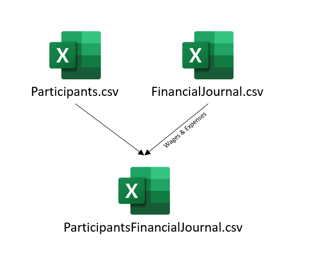
Participants.csv- Information of all participants. -
FinancialJournal.csv- Input of the participant’s wages and expenses.
-
Data Wrangling
knitr::include_graphics("qn1_concept.png")
participants <- read_csv("rawdata/Participants.csv")
finance <- read_csv("rawdata/FinancialJournal.csv")
Reducing of File Size uploading to Git
To reduce the requirement to upload the original data set, I will use the saveRDS function to convert my working tibble dataframe to a R data format namely .rds. We will subsequently use the readRDS function to read the data files in R.
Data Preparation
Through the data from the participants, we can identify a total of 1011 participants ad 6 different attributes. The finance data shows the timestamp of the participants log and a category column. It seems like the data is in the long format and therefore we will subsequently pivot the data table to a wide format. We can also see that household size should be a categorical data rather than a numerical data. We address these issues using the dplyr package.
summary(participants) participantId householdSize haveKids age
Min. : 0.0 Min. :1.000 Mode :logical Min. :18.00
1st Qu.: 252.5 1st Qu.:1.000 FALSE:710 1st Qu.:29.00
Median : 505.0 Median :2.000 TRUE :301 Median :39.00
Mean : 505.0 Mean :1.964 Mean :39.07
3rd Qu.: 757.5 3rd Qu.:3.000 3rd Qu.:50.00
Max. :1010.0 Max. :3.000 Max. :60.00
educationLevel interestGroup joviality
Length:1011 Length:1011 Min. :0.000204
Class :character Class :character 1st Qu.:0.240074
Mode :character Mode :character Median :0.477539
Mean :0.493794
3rd Qu.:0.746819
Max. :0.999234 summary(finance) participantId timestamp category
Min. : 0.0 Min. :2022-03-01 00:00:00.00 Length:1856330
1st Qu.: 222.0 1st Qu.:2022-06-14 12:30:00.00 Class :character
Median : 464.0 Median :2022-10-06 16:20:00.00 Mode :character
Mean : 480.8 Mean :2022-10-07 12:36:41.13
3rd Qu.: 726.0 3rd Qu.:2023-01-29 19:10:00.00
Max. :1010.0 Max. :2023-05-25 00:05:00.00
amount
Min. :-1562.726
1st Qu.: -5.594
Median : -4.000
Mean : 19.922
3rd Qu.: 22.856
Max. : 4096.526 As part of Data Preparation, I prefer to ensure my columns are well worded. This would reduce the need to reword the X and Y axis subsequently for all the plots.
participants <- participants %>%
  rename('Participant Id' = 'participantId',
         'Household Size' = 'householdSize',
         'Have Kids' = 'haveKids',
         'Age' = 'age',
         'Education Level' = 'educationLevel',
         'Interest Group' = 'interestGroup',
         'Joviality' = 'joviality')


colnames(participants) # verify if the columns have been renamed correctly
[1] "Participant Id" "Household Size" "Have Kids" "Age"
[5] "Education Level" "Interest Group" "Joviality" #rename value
participants$`Education Level` <- sub('HighSchoolOrCollege',
'High School or College',
participants$`Education Level`)
participants$`Household Size` <- as.factor(participants$`Household Size`)
participants$`Education Level` <- factor(participants$`Education Level`, levels = c(
"Low", "High School or College", "Bachelors", "Graduate"), ordered = TRUE) #create factor data object to categorise the Education Level by levels.We will now examine how many different input categories are there. There are 6 different categories and 1011 participants throughout the period of 1 year and 2 months based on the timestamp. There should be a total of 2,547,720 financial records but the total recorded data was only 1,856,330. This shows some participants might not have recorded their finance throughout the period. We will now identify participants that are not consistent in their input.
unique(finance$category)[1] "Wage" "Shelter" "Education" "RentAdjustment"
[5] "Food" "Recreation" Based on our analysis of the data, there are 131 participants who have only logged in less than 12 times throughout the period of analysis. We will identify these participants as inactive and will exclude them during our analysis of the the population demographics.
income <- finance %>%
  filter(category == 'Wage') %>% # extract only wage data
  select(participantId, amount) %>%
  group_by(participantId) %>%
  summarise(count = n()) %>%
  ungroup()

inactive <- finance %>%
  filter(category == 'Wage') %>% # extract only wage data
  select(participantId, amount) %>%
  group_by(participantId) %>%
  summarise(count = n()) %>%
  filter (count < 13) %>%
ungroup()Since the period of study is 15 months, we will extract the average monthly wage of each active participants using the summarise function and rounding the answer to 2 decimal place.
active_participants <- active_participants %>%
  left_join (active_finance, by = c("Participant Id" = "participantId")) %>%
  mutate(Joviality = Joviality * 100)
Visualisation and Insights
Visualising using Static Graph
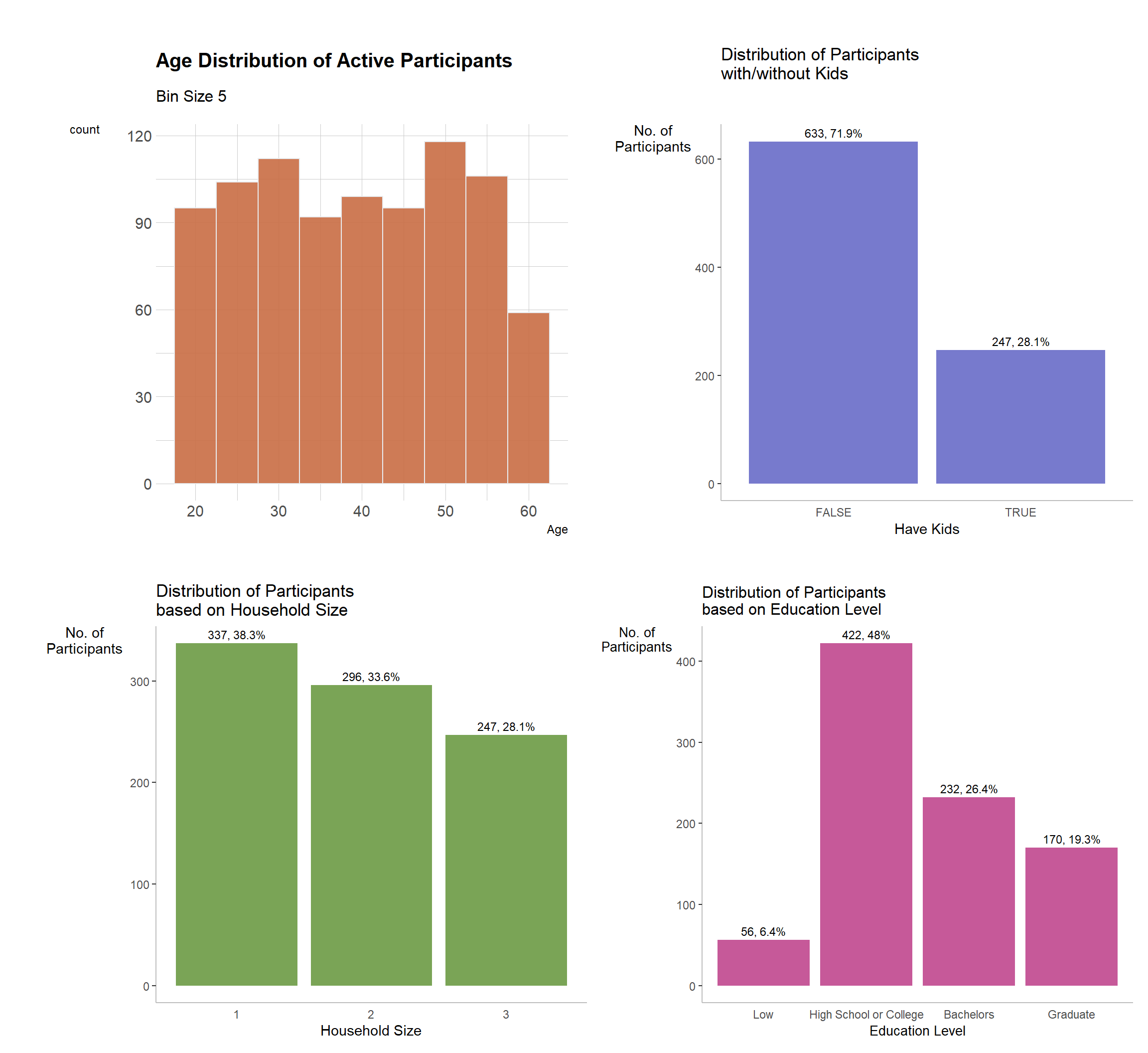
We will first visualise the distribution of the different attributes.
-
geom_text()is used to add annotations of the count and % values forgeom_bar() - Grids and background color are removed for a cleaner look as annotations are included.
- To choose the different colours for the graph, I use medialab to decide on the Hue colors based on the number of graphs.
age <- ggplot (active_participants, aes (x=Age)) +
  geom_histogram(binwidth=5, fill="#c96d44", color="#e9ecef", alpha=0.9) +
    labs(title = "Age Distribution of Active Participants", subtitle = "Bin Size 5") +
    theme_ipsum() +
    theme(
      plot.title = element_text(size=15), axis.title.y= element_text(angle=0)
    )

hKids <- active_participants %>%
  ggplot(aes(x = `Have Kids`)) +
  geom_bar(fill= '#777acd') +
  geom_text(stat = 'count',
           aes(label= paste0(stat(count), ', ',
                             round(stat(count)/sum(stat(count))*100,
                             1), '%')), vjust= -0.5, size= 3) +
  labs(y= 'No. of\nParticipants', title = "Distribution of Participants \nwith/without Kids") +
  theme(axis.title.y= element_text(angle=0), axis.ticks.x= element_blank(),
        panel.background= element_blank(), axis.line= element_line(color= 'grey'))


household <- active_participants %>%
  ggplot(aes(x = `Household Size`)) +
   geom_bar(fill= '#7aa456') +
  geom_text(stat = 'count',
           aes(label= paste0(stat(count), ', ',
                             round(stat(count)/sum(stat(count))*100,
                             1), '%')), vjust= -0.5, size= 3) +
  labs(y= 'No. of\nParticipants', title = "Distribution of Participants \nbased on Household Size") +
  theme(axis.title.y= element_text(angle=0), axis.ticks.x= element_blank(),
        panel.background= element_blank(), axis.line= element_line(color= 'grey'))

education <- active_participants %>%
  ggplot(aes(x = `Education Level`)) +
   geom_bar(fill= '#c65999') +
  geom_text(stat = 'count',
           aes(label= paste0(stat(count), ', ',
                             round(stat(count)/sum(stat(count))*100,
                             1), '%')), vjust= -0.5, size= 3) +
  labs(y= 'No. of\nParticipants', title = "Distribution of Participants \nbased on Education Level") +
  theme(axis.title.y= element_text(angle=0), axis.ticks.x= element_blank(),
        panel.background= element_blank(), axis.line= element_line(color= 'grey'), title = element_text(size = 10))


(age + hKids)/(household + education) #using patchwork to stitch the different graphs together
joy <- ggplot (active_participants, aes (x=Joviality)) +
  geom_histogram(binwidth=5, fill="#9c954d", color="#e9ecef", alpha=0.9) +
    labs(title = "Joviality Distribution of Active Participants", subtitle = "Bin Size 5") +
    theme_ipsum() +
    theme(
      plot.title = element_text(size=15), axis.title.y= element_text(angle=0)
    )

income <- ggplot (active_participants, aes (x=Income)) +
  geom_histogram(binwidth=1000, fill="#b067a3", color="#e9ecef", alpha=0.9) +
    labs(title = "Income Distribution of Active Participants", subtitle = "Bin Size 1000") +
    theme_ipsum() +
    theme(
      plot.title = element_text(size=15), axis.title.y= element_text(angle=0)
    )

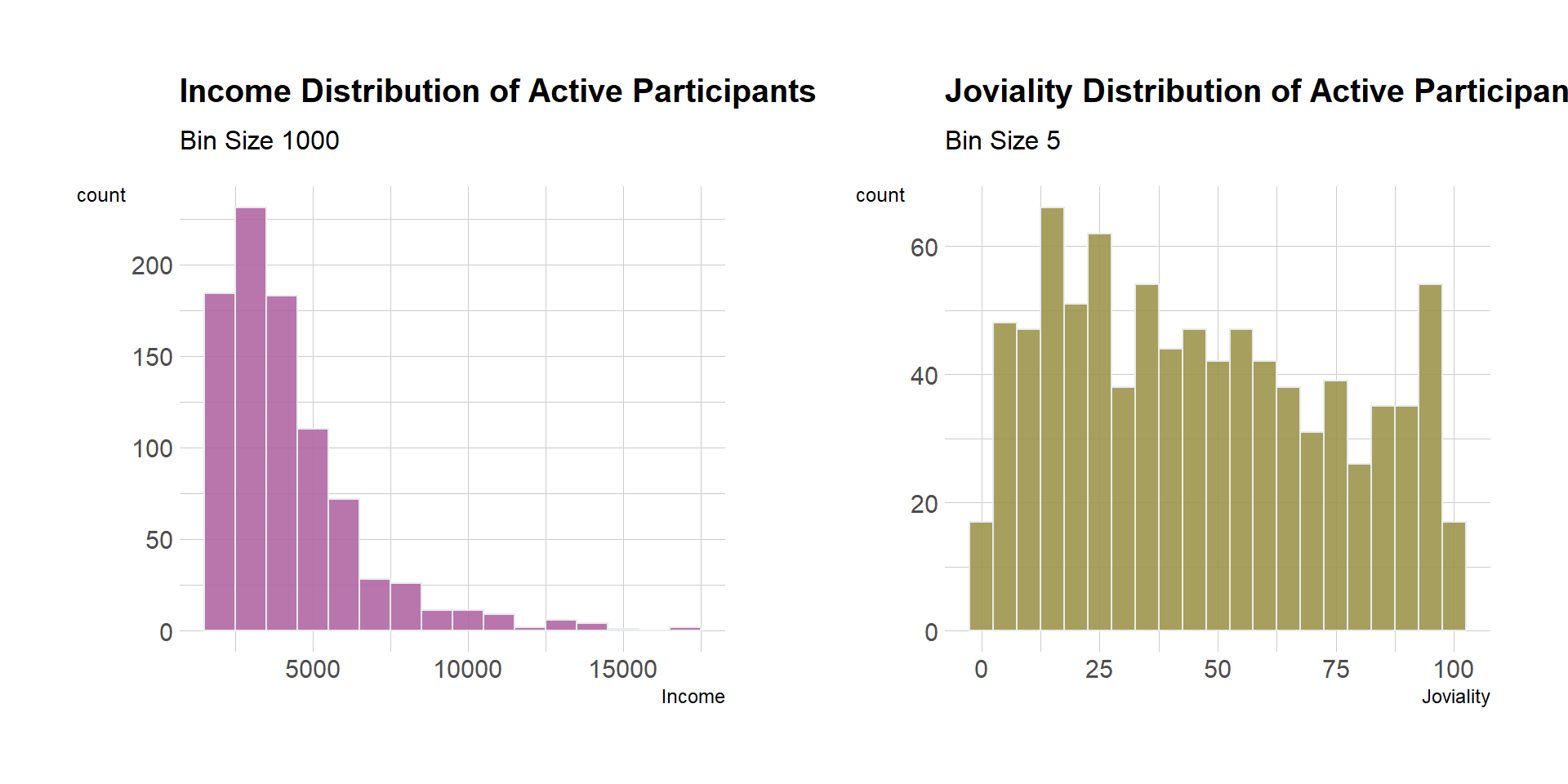
income + joy
We will conduct binning on our numerical data such as Age, Income and Joviality. We use the ntile function to break the values and case_when() to change the group labels accordingly.
active_participants_grouped <- active_participants %>%
  mutate (Income_group = ntile(Income, 4)) %>%
  mutate (Joviality_group = ntile(Joviality, 4)) %>%
  mutate (Income_group = case_when(
    Income_group == 1 ~ "Low Income",
    Income_group == 2 ~ "Mid-Low Income",
    Income_group == 3 ~ "Mid-High Income",
    Income_group == 4 ~ "High Income"
  )) %>%
  mutate (Joviality_group = case_when(
    Joviality_group == 1 ~ "Low Joy",
    Joviality_group == 2 ~ "Mid-Low Joy",
    Joviality_group == 3 ~ "Mid-High Joy",
    Joviality_group == 4 ~ "High Joy"
  ))
Visualising using Interactive Graph
We will now analyse the data using interactive graphs such as parallel set plot. We will leverage on the parset library to provide interactive function. The interesting feature about the parset function is that it allows the user to dynamically shift the levels of the attributes (top-bottom and left-right), providing the user a more interactive visualisation of the data set.
active_participants_parset <- active_participants_grouped %>%
  select (`Household Size`, `Have Kids`, `Education Level`, `Interest Group`, Income_group, Joviality_group)

parset(active_participants_parset)
Visualising using Statistical Graph
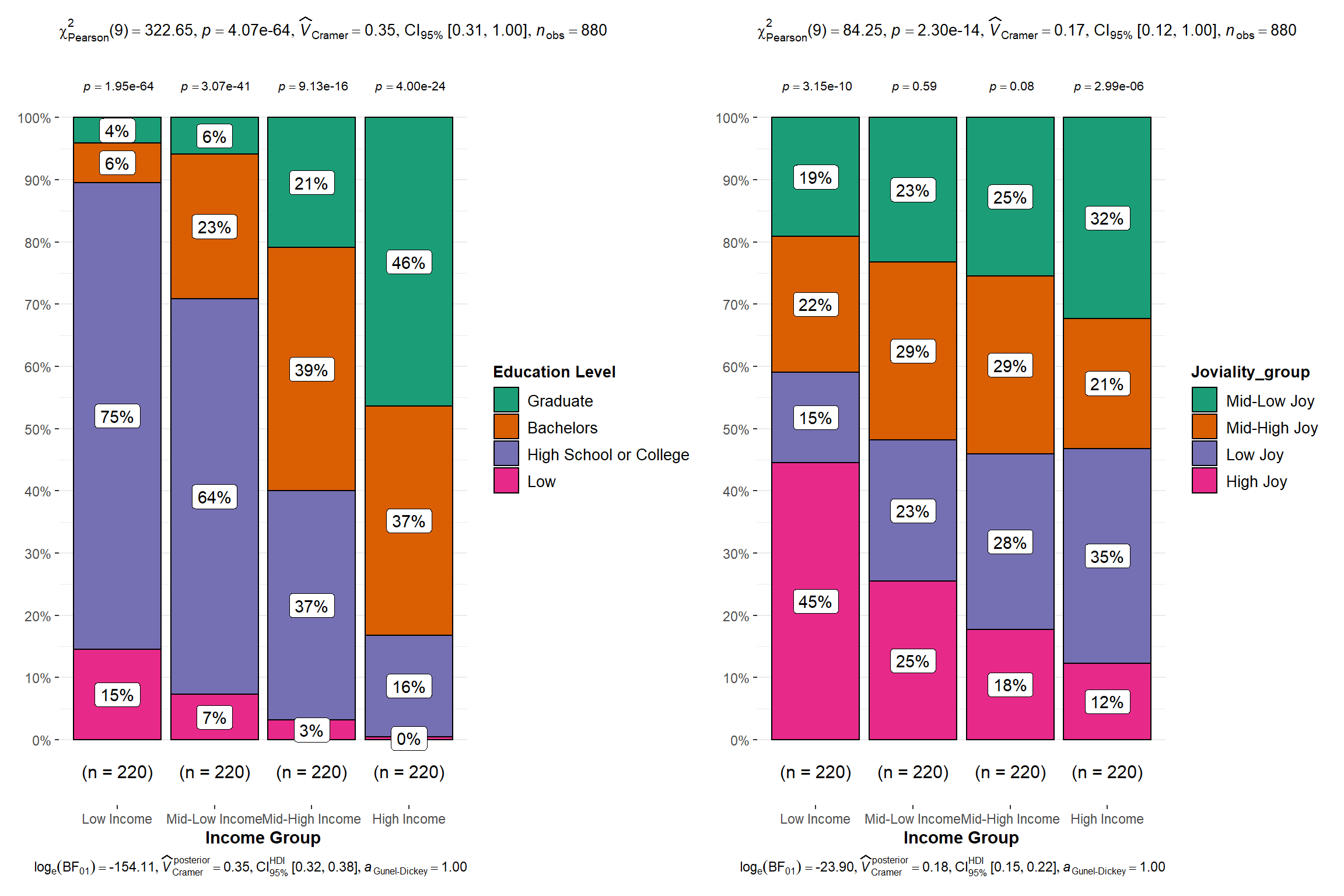
From the Parset plot, we identify a few probable relationship such as Education Level to Income Level etc. We will now use statistical plot to verify our claim. The ggstatsplot library provides a suite of statistical plot to allow user to choose the plot based on its data set. For this study, since our attributes are in categorical form, I will leverage on the ggbarstats.
Insights
Pearson’s \(x^2\)-test of independence revealed that, across 880 participants,there was a significant association between Income Level, Education Level and Joviality Level. (p-value below alpha value of 0.05). The Bayes Factor for the left analysis revealed that the data were \(8e^{66}\) times more probable under the alternative hypothesis as compared to the null hypothesis. This can be considered extreme evidence (Sandra Andraszewicz, 2015) in favor of the alternative hypothesis. The Bayes Factor for the right analysis revealed that the data were 23968348874 times more probable under the alternative hypothesis as compared to the null hypothesis. This can also be considered extreme evidence in favor of the alternative hypothesis.
active_participants_parset$Income_group <- factor(active_participants_parset$Income_group, levels = c(
  "Low Income", "Mid-Low Income", "Mid-High Income", "High Income"), ordered = TRUE) #create factor data object to segment the Education Level by levels.

income <- ggbarstats(
  data = active_participants_parset,
  x = `Education Level`,
  y = Income_group,
  type = "np",
  xlab = "Income Group"
)

joy <- ggbarstats(
  data = active_participants_parset,
  x = Joviality_group,
  y = Income_group,
  type = "np",
  xlab = "Income Group"
)


income + joy
Conclusion
It is important for data analyst to understand the importance of static and interactive graphs, how we should leverage these tools to provide appropriate data visualisation and subsequently use statistical graphs to draw statistical conclusion to support the hypothesis.